The Moth
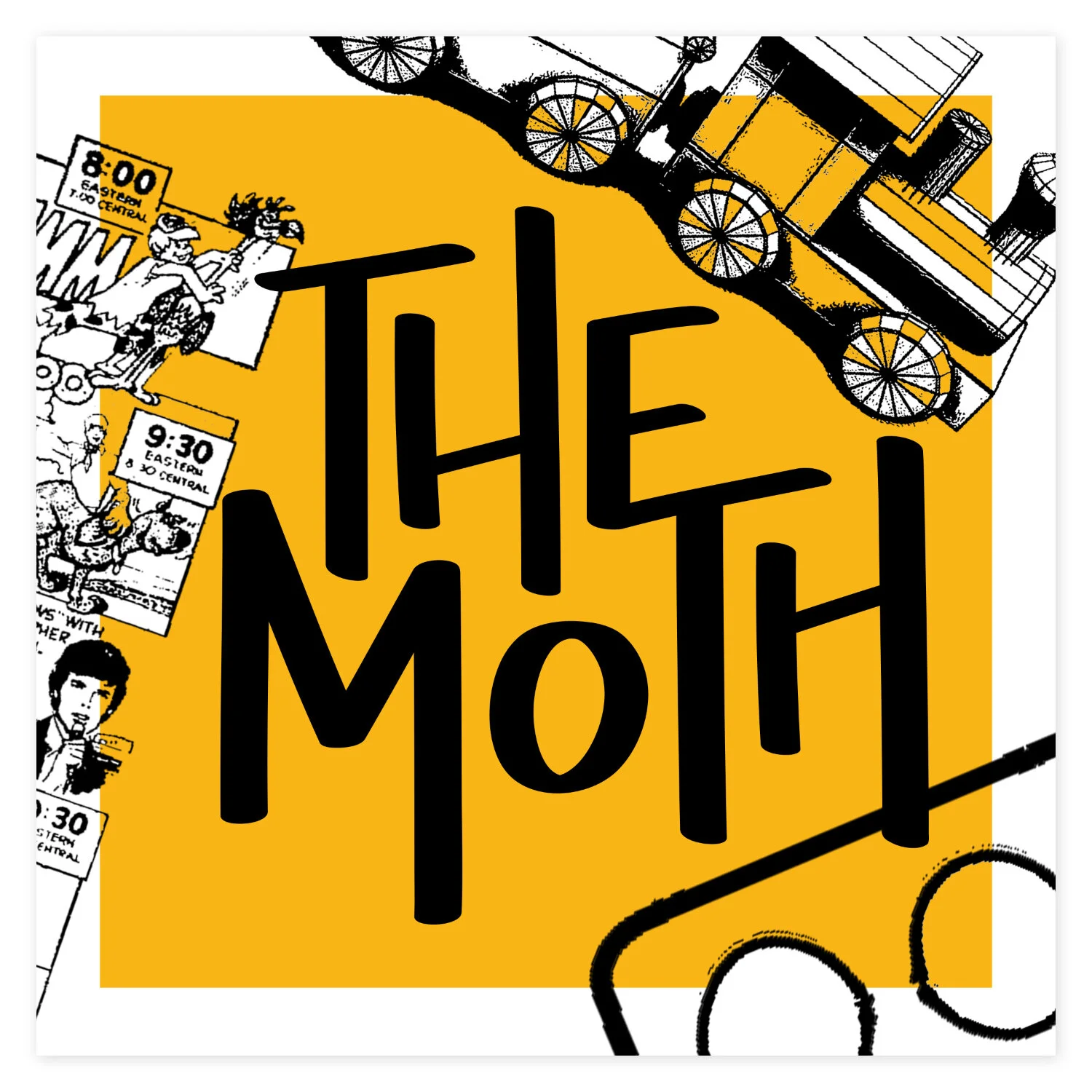
Rebranding for The Moth, a company that promotes the art and craft of storytelling through live shows, podcasts and books. The system includes a new brand identity (logo, type system, color palette and imagery system), event posters, podcast covers and a new digital experience.
Planning + brainstorming
“The Moth’s mission is to promote the art and craft of storytelling and to honor and celebrate the diversity and commonality of human experience.”
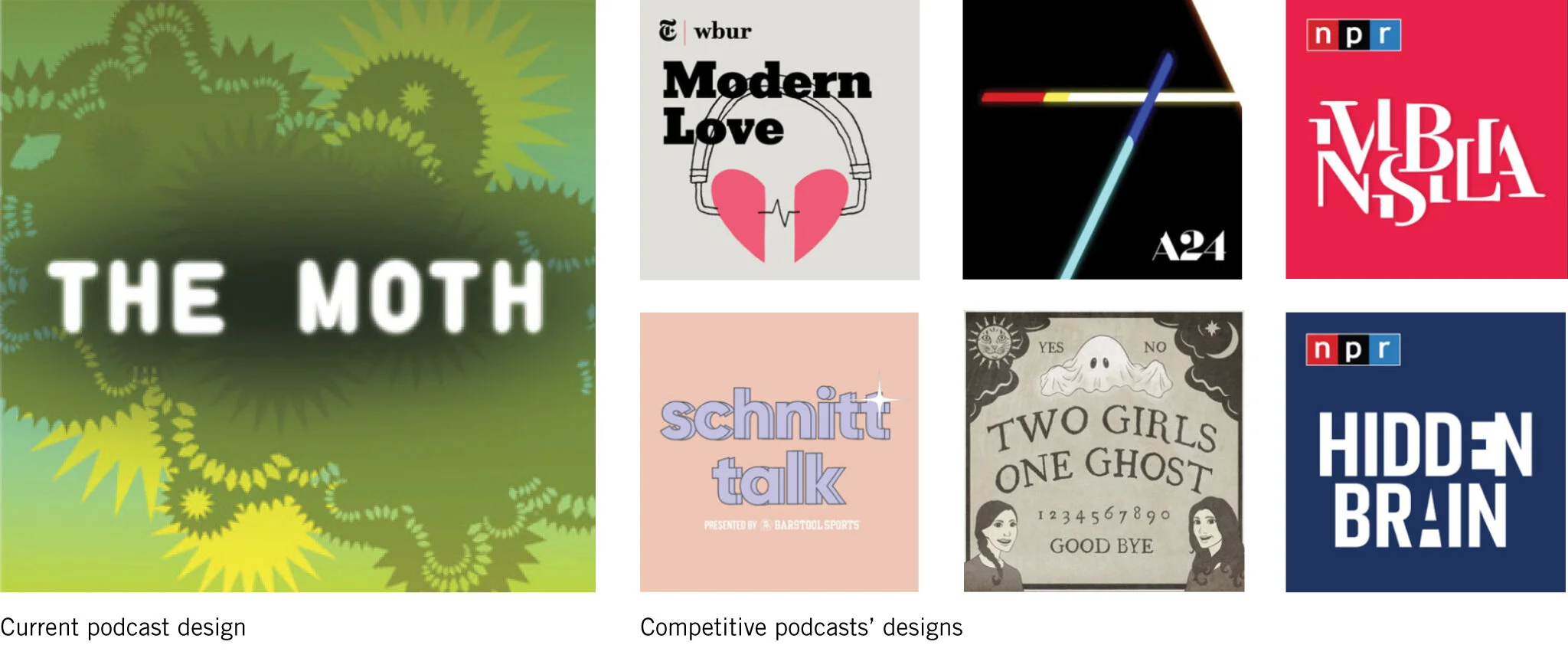
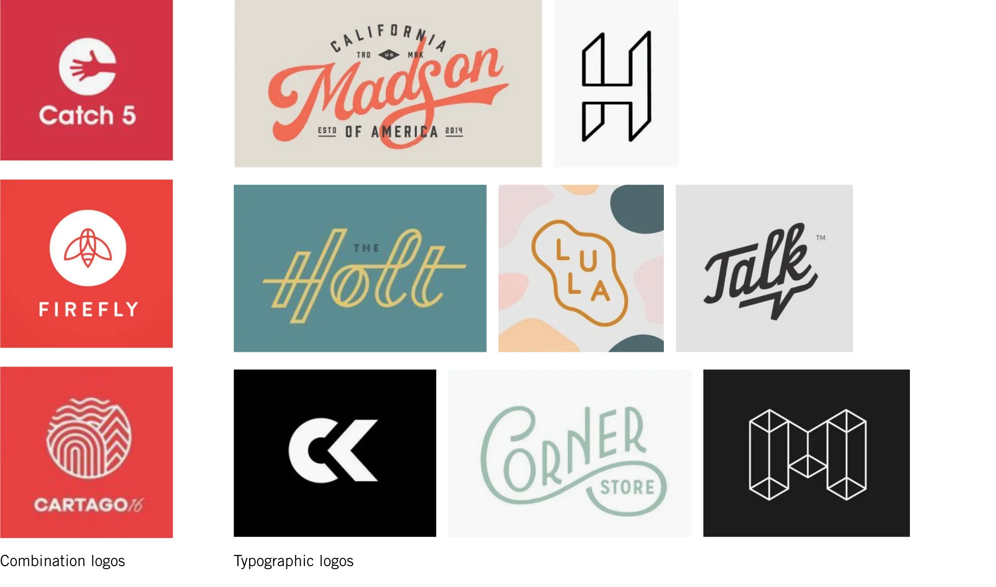
After reading The Moth’s mission statement, my primary goals were to reenvision The Moth’s logo, brand and primary touchpoints and create a more cohesive digital experience for dedicated Moth supporters. In both of these goals, my objective was to emphasize the sense of community throughout The Moth’s brand. By researching other podcasts and exploring logo designs, I was able to begin the process of brainstorming and executing concepts for The Moth.
Competitive research
Logo research
Exploring concepts + next steps
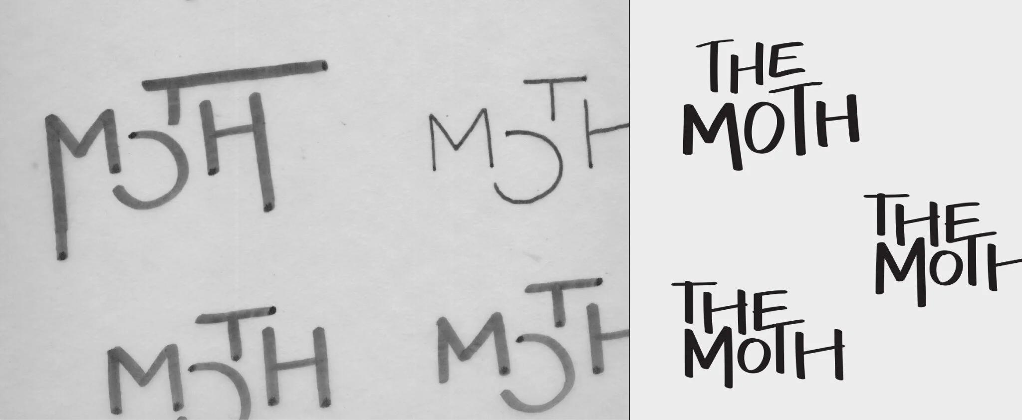
My research and brainstorming helped me gather my thoughts to start sketching logos and planning next steps. I began with sketching by hand and then moved my concepts to the computer once I felt they were in a good place. Once in Illustrator, I iterated on my designs until I landed on the final logo.
The brand
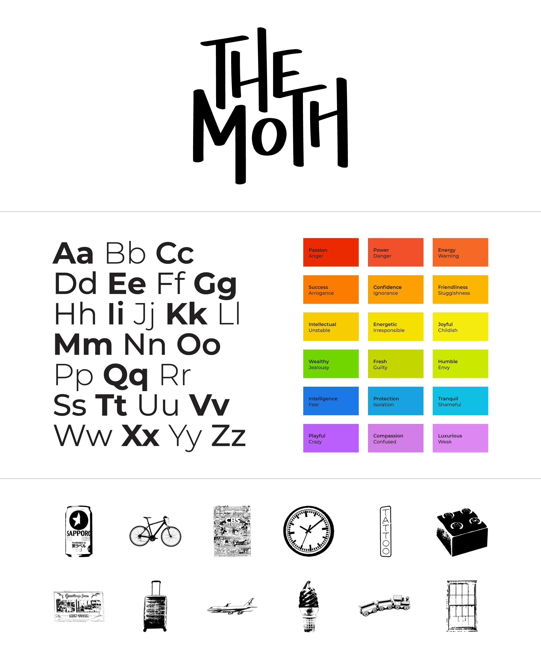
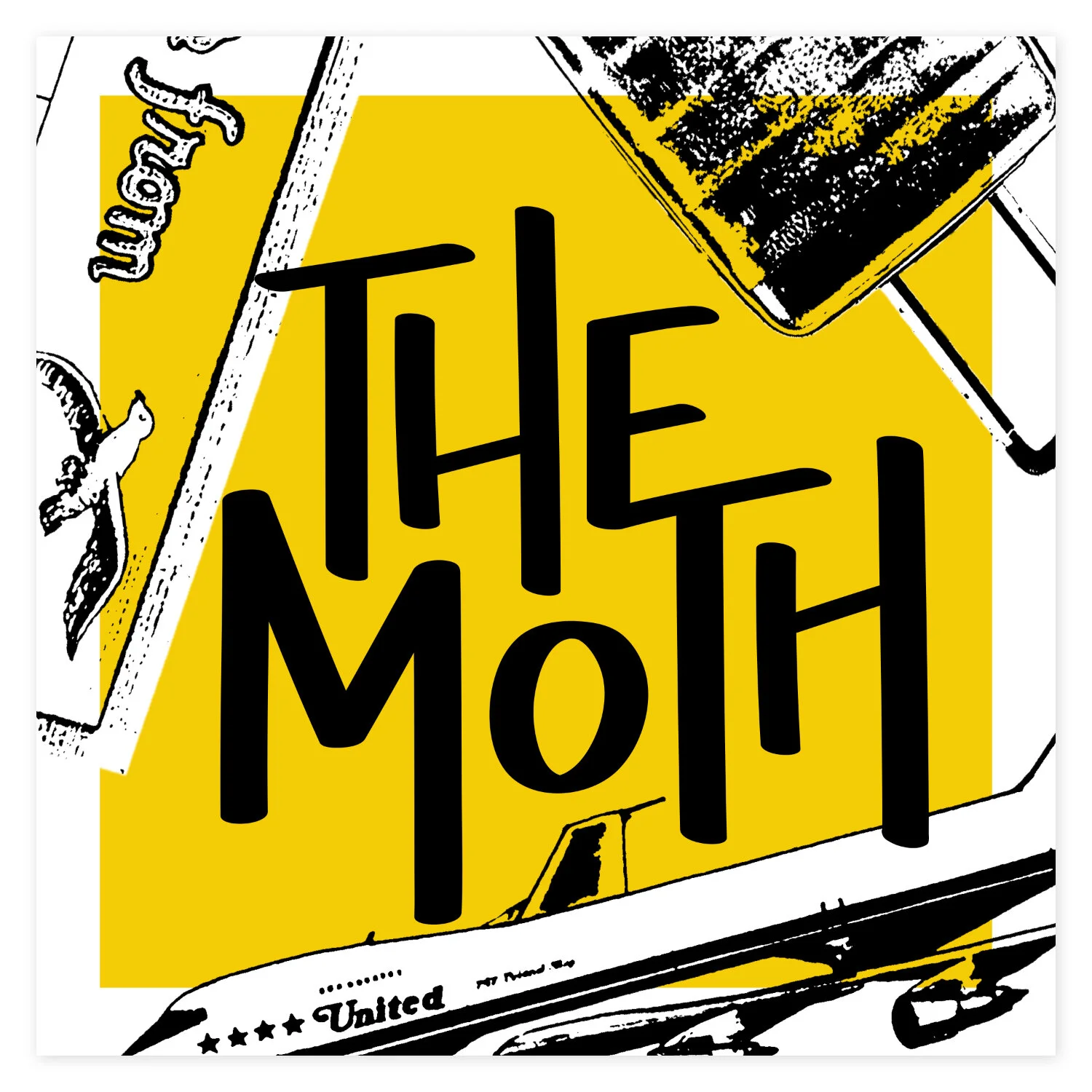
From the logo to the color palette, I wanted each aspect of the brand to reflect The Moth’s community and culture. The conjoined letterforms and compressed composition of the logo symbolize The Moth’s tight knit community, while the expressive, hand-done type emphasizes the company’s originality and personality. To balance the logo’s expressive design, I chose Montserrat and all its weights as the brand’s only typeface. Montserrat’s simple, rounded forms compliment the logo’s vertical orientation and its multiple weights highlight its diversity. The Moth’s color palette uses vibrant and saturated colors that correlate to specific emotions and feelings. As for the image library, the variety of images used for The Moth’s collateral seem random, but are actually deliberately chosen to correspond with specific stories and live event themes.
Event posters
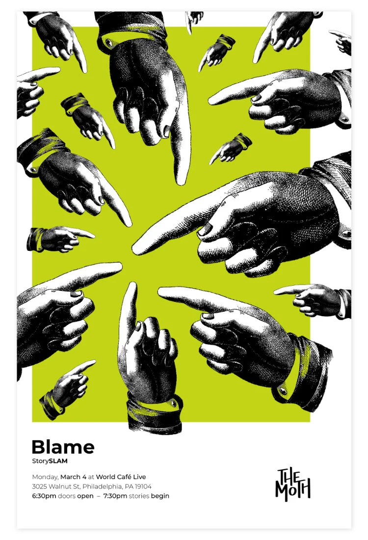
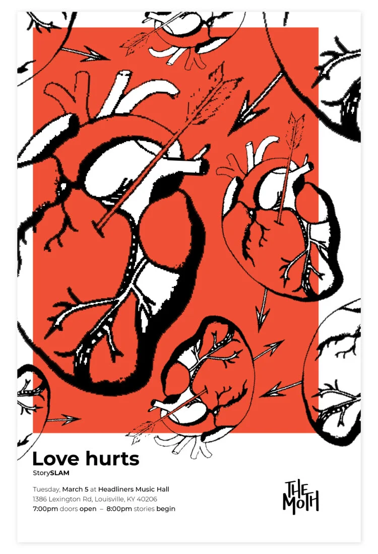
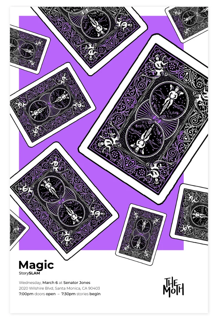
The layout of each poster is consistent, but the images and color vary depending on the event’s theme. The examples below are for event’s with the themes: Blame, Love hurts and Magic.
Cover art design
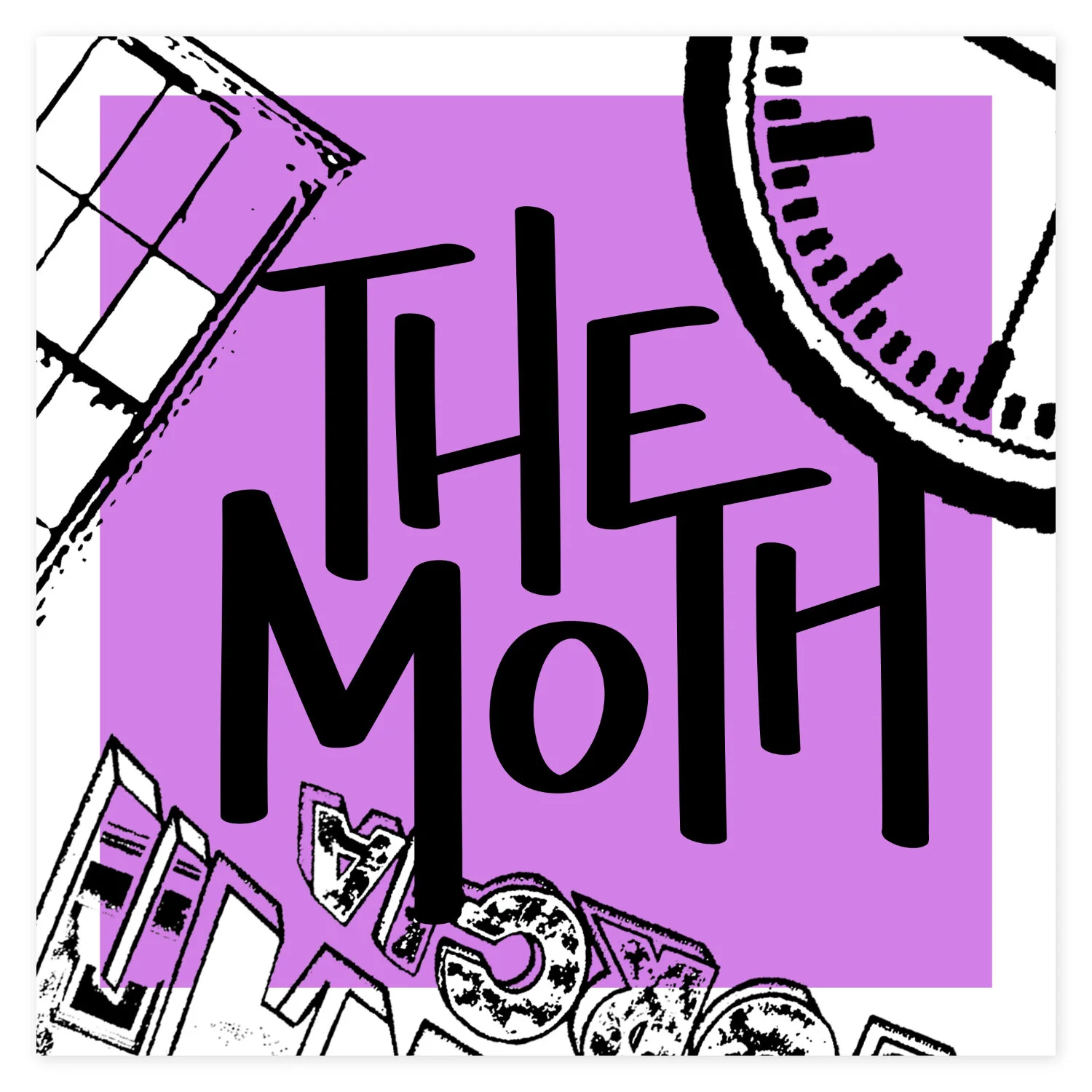
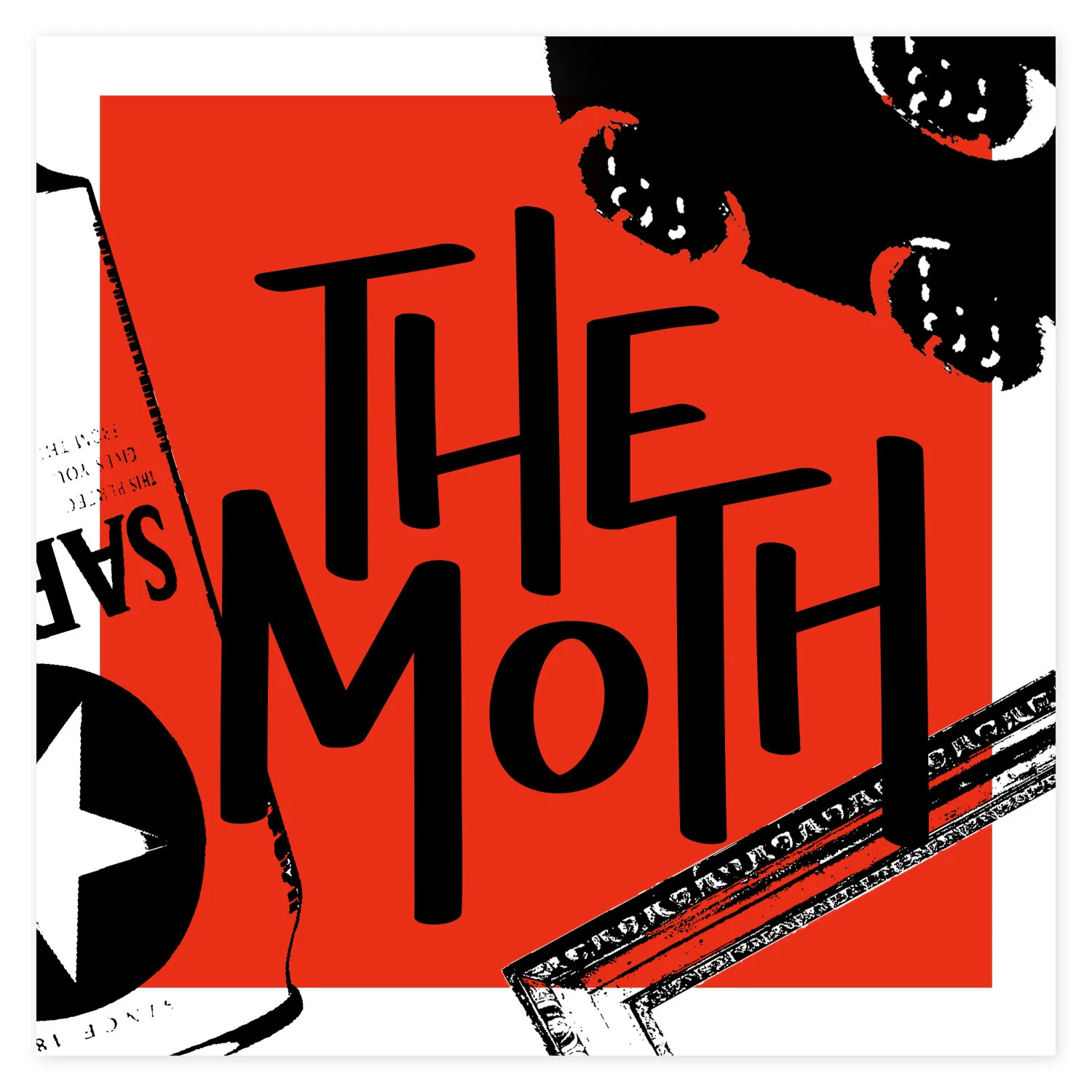
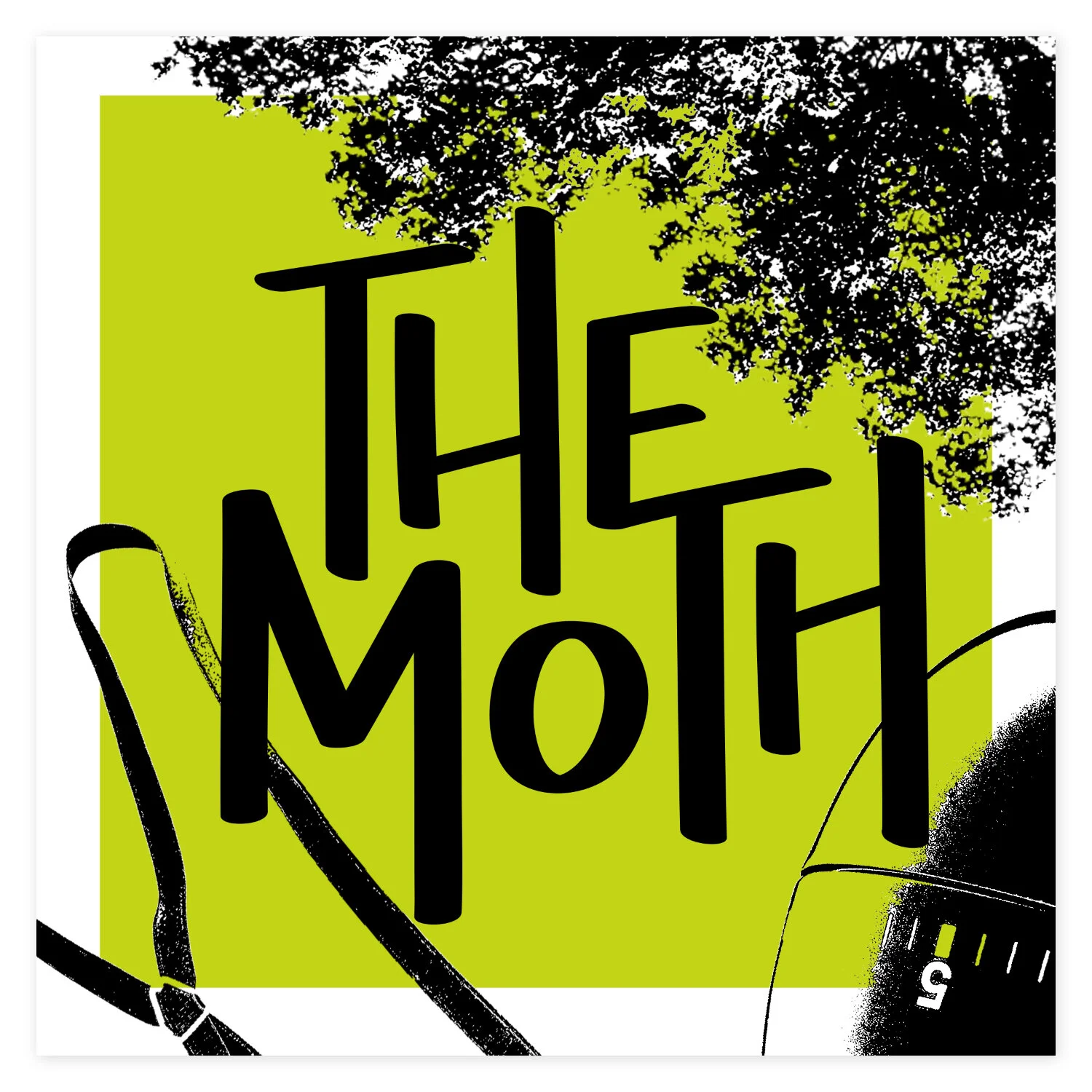
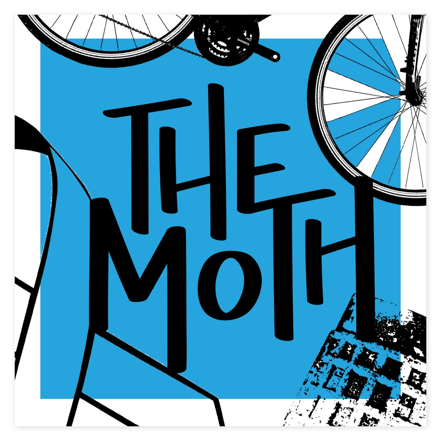
Considering each episode The Moth produces has a different title and features stories relating to a specific theme, this rebrand introduces the idea of stories instead of podcasts. Like the event posters, the layout of each story cover is the same, but the images and color vary depending on the context of the stories told.
Mobile app
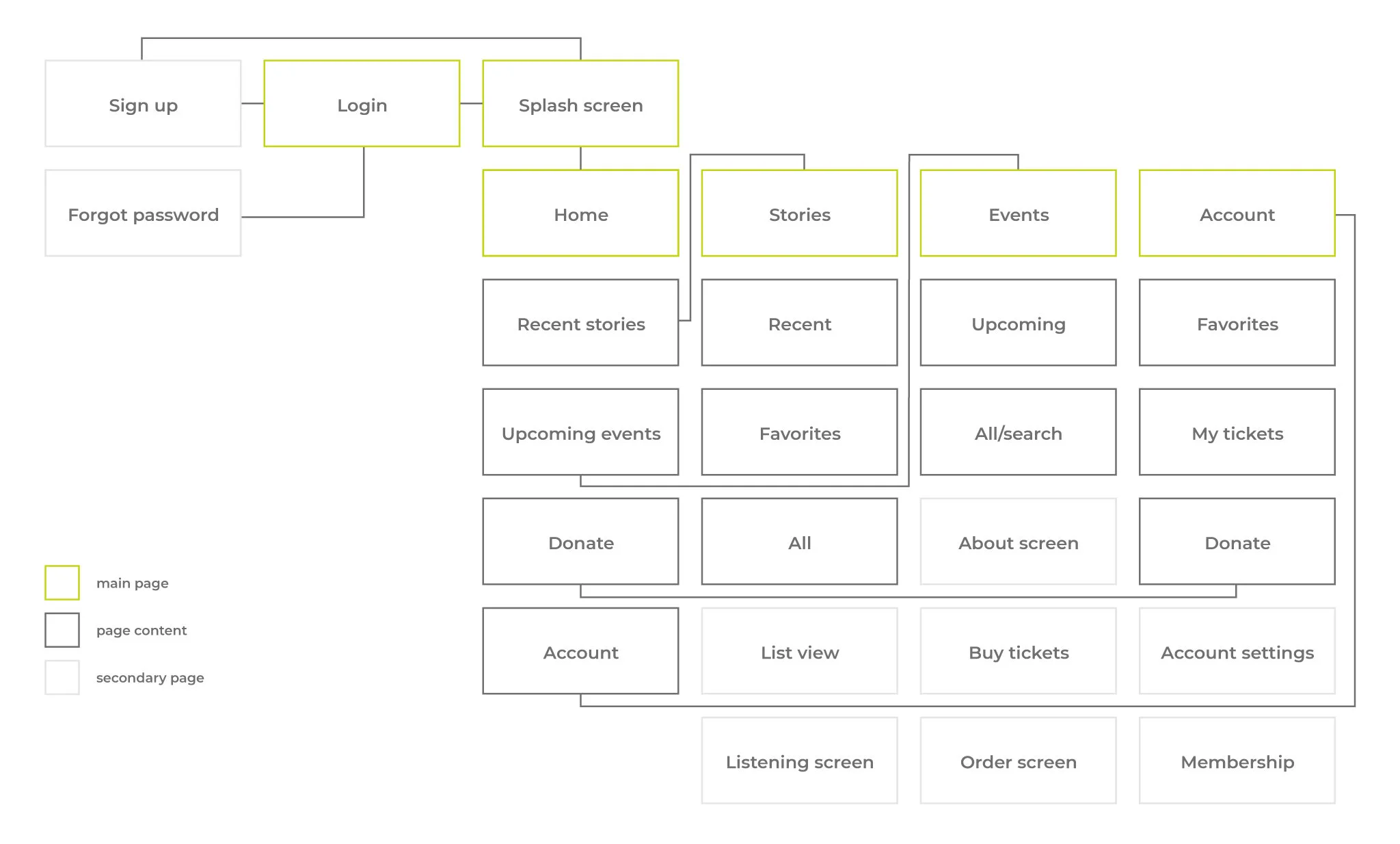
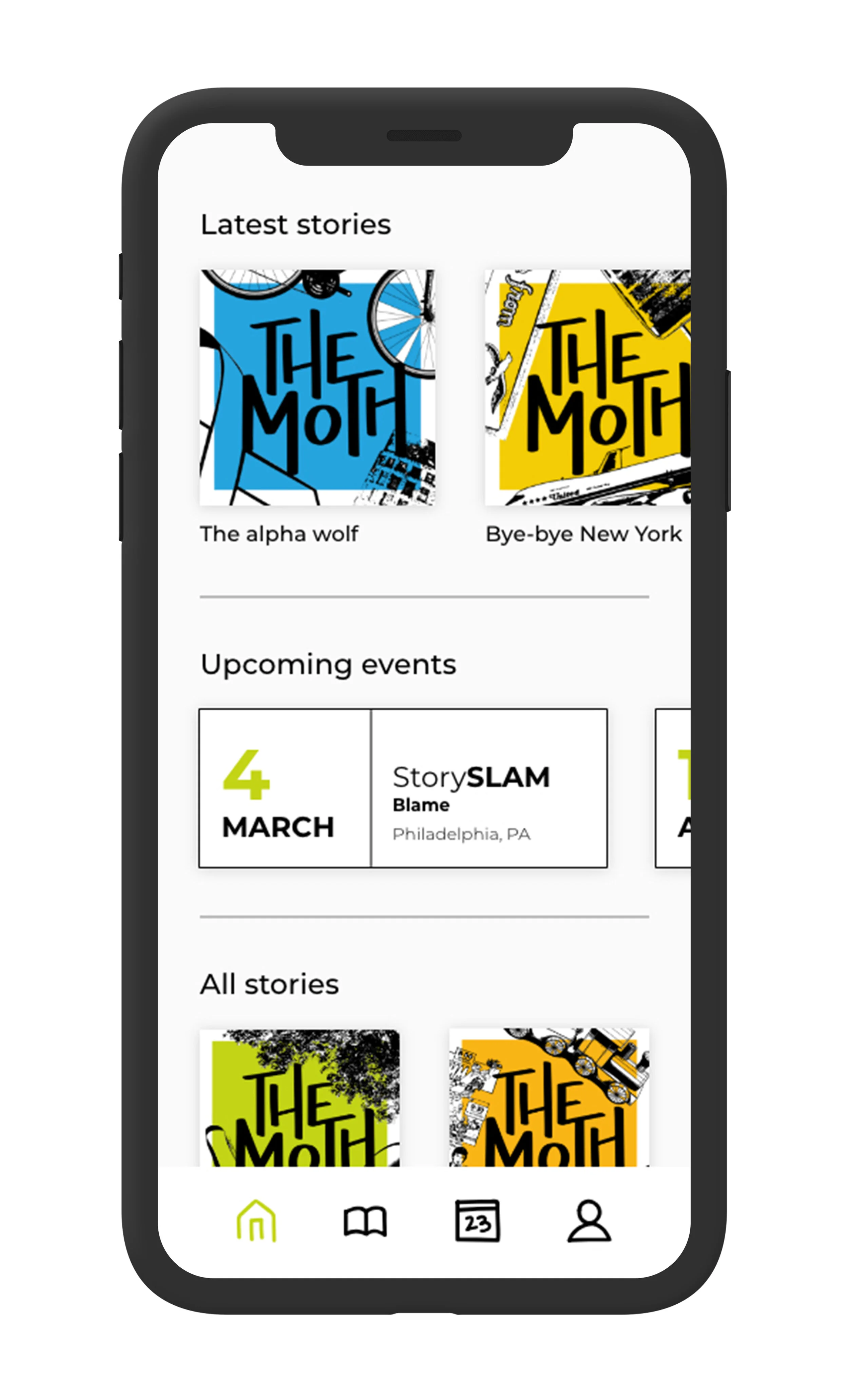
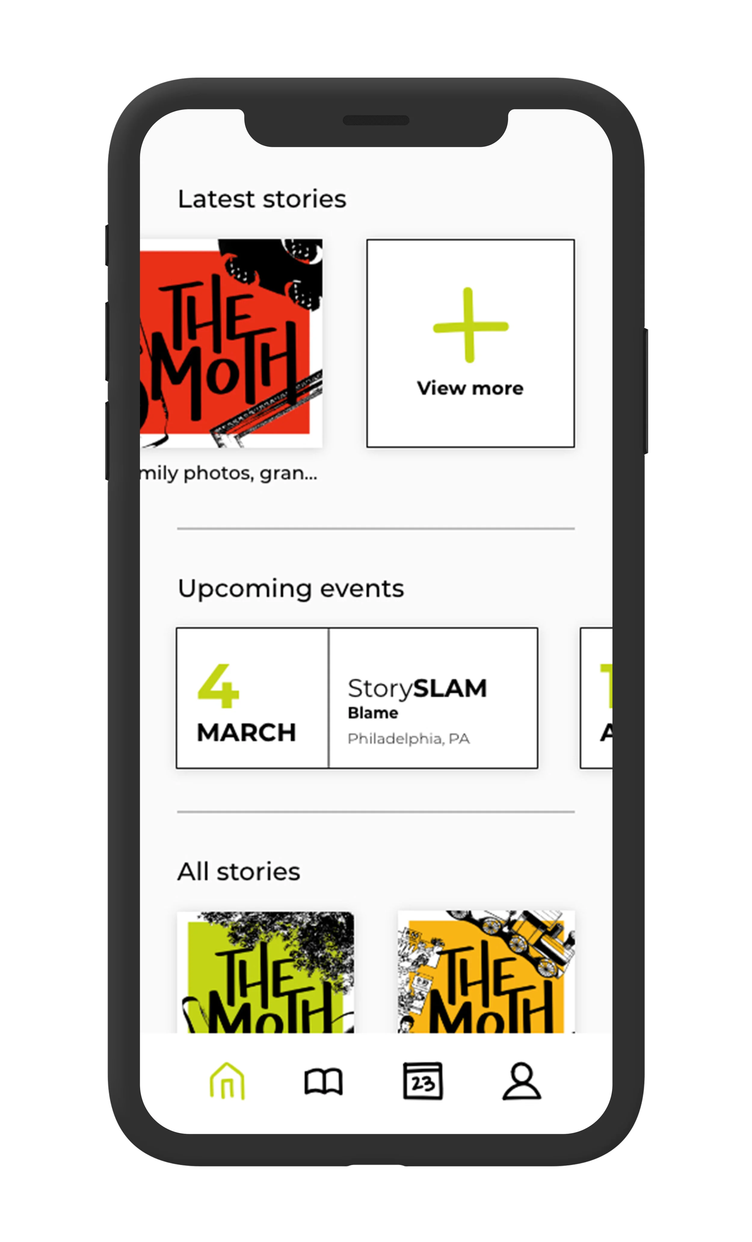
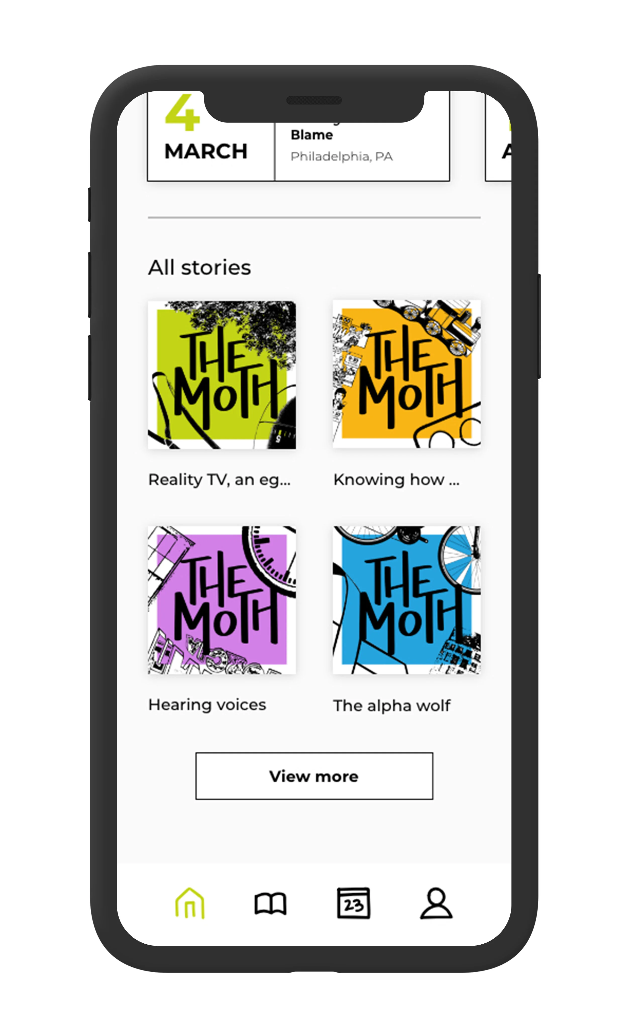
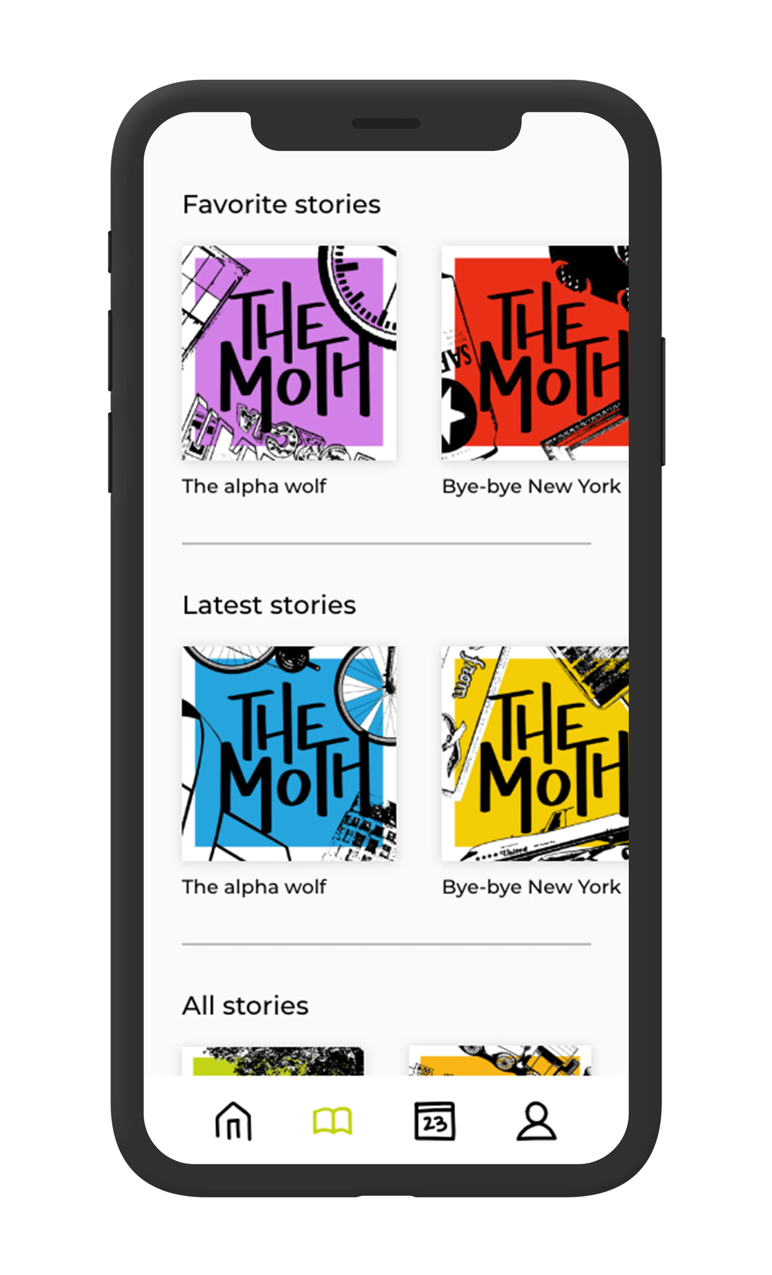
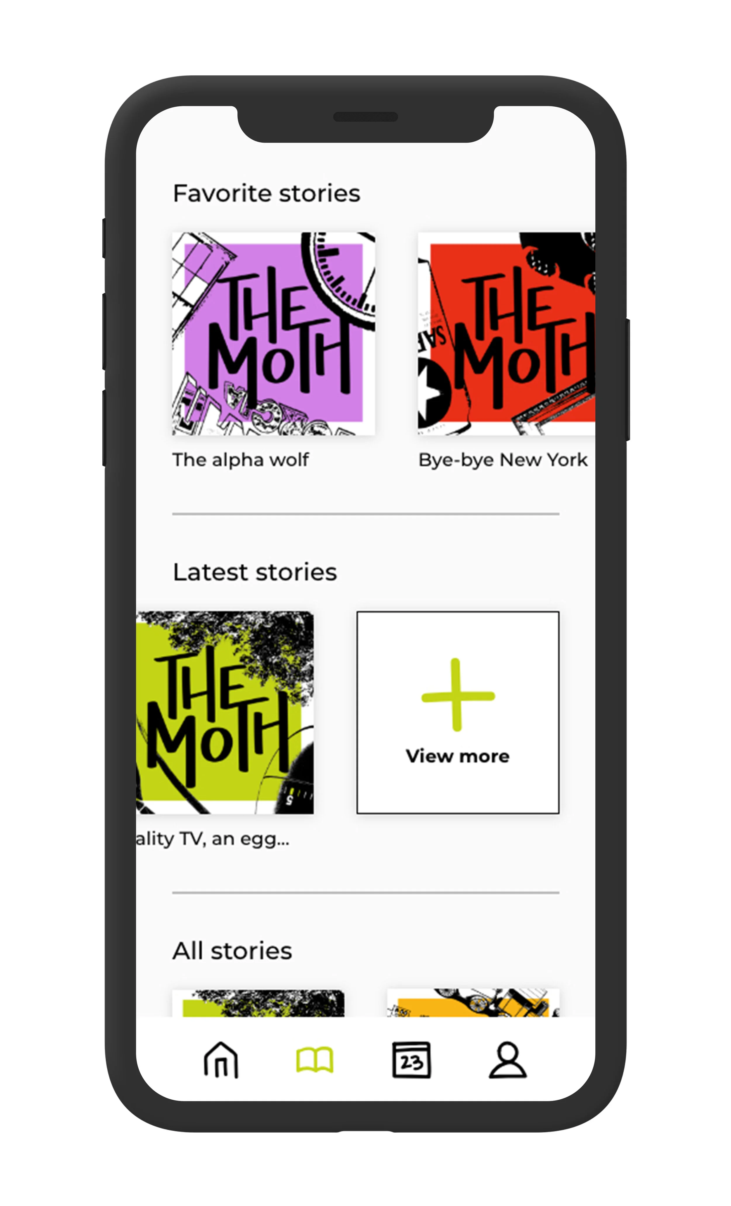
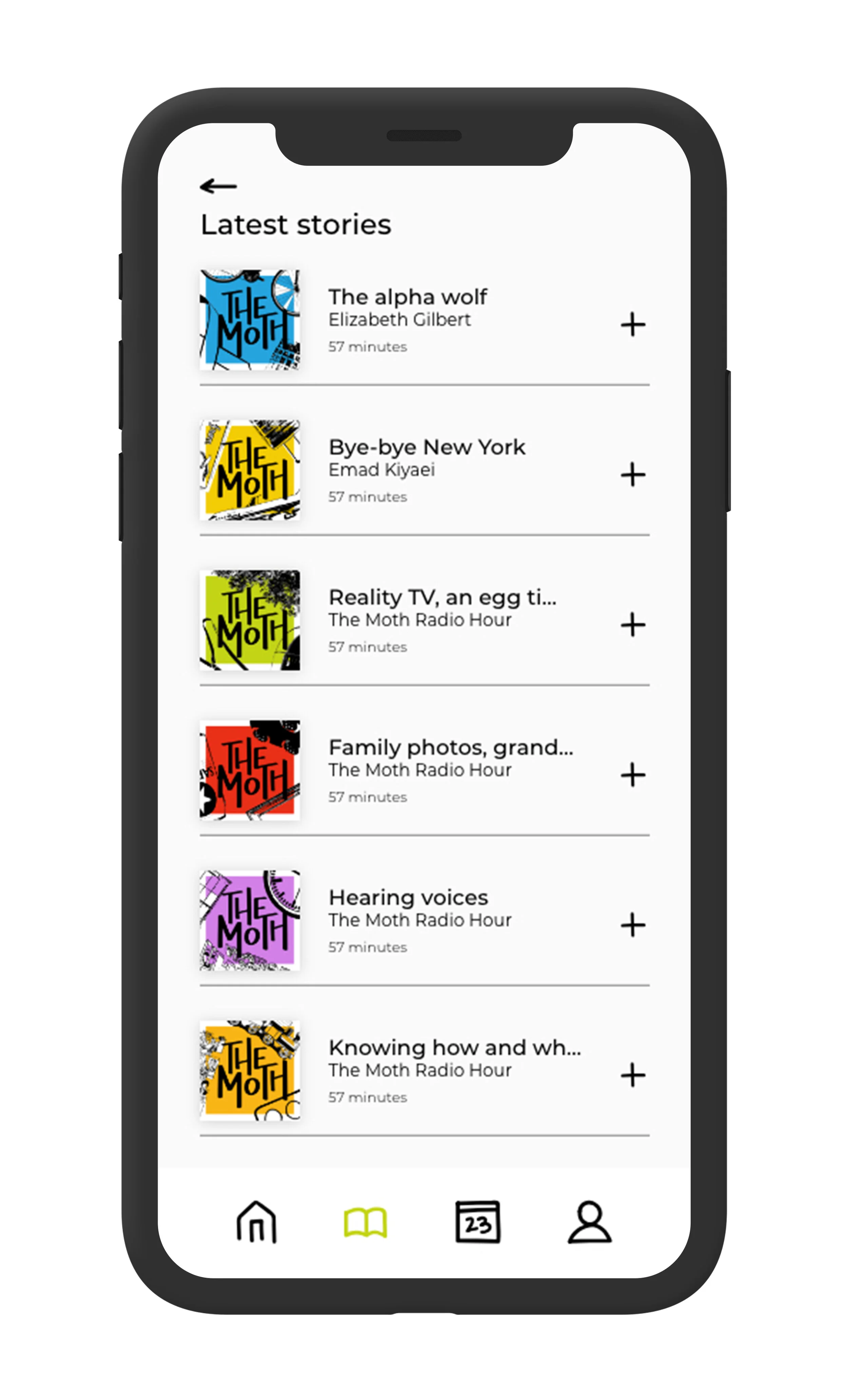
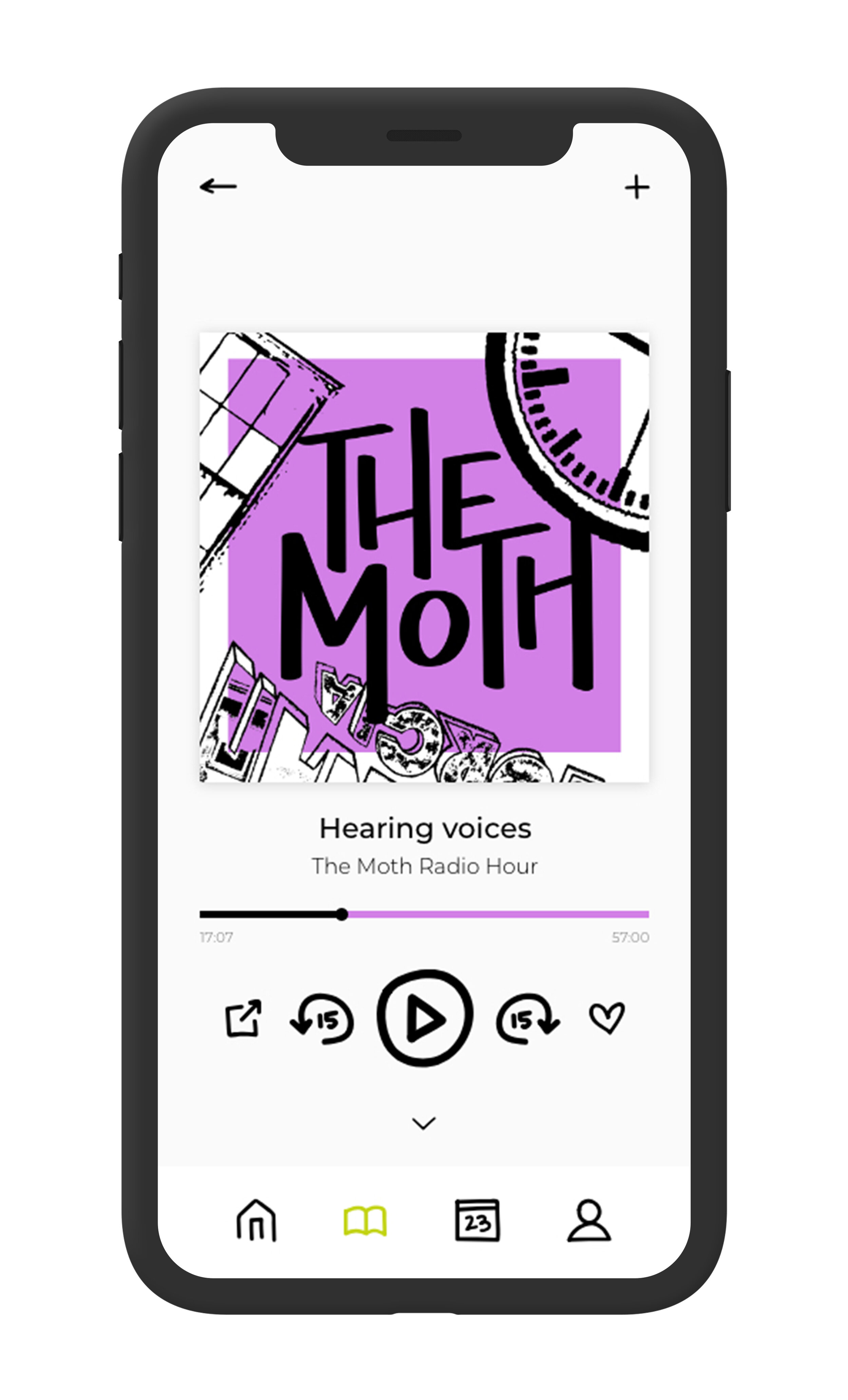
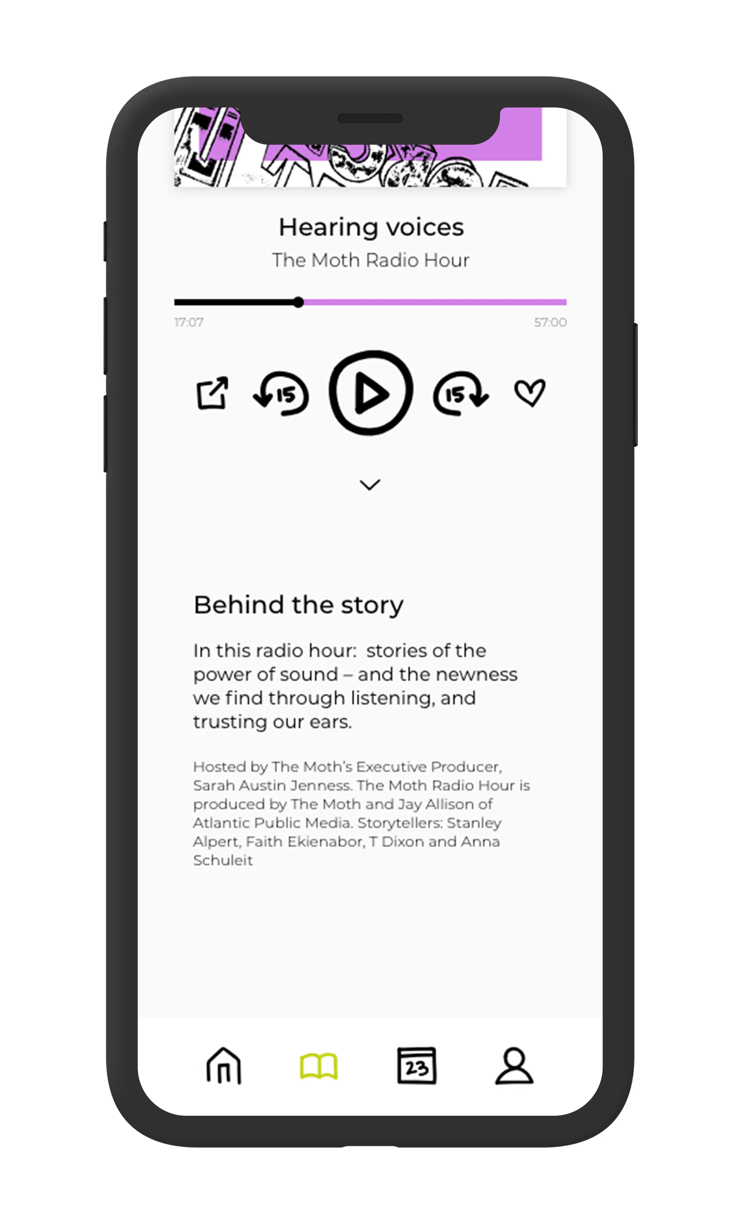
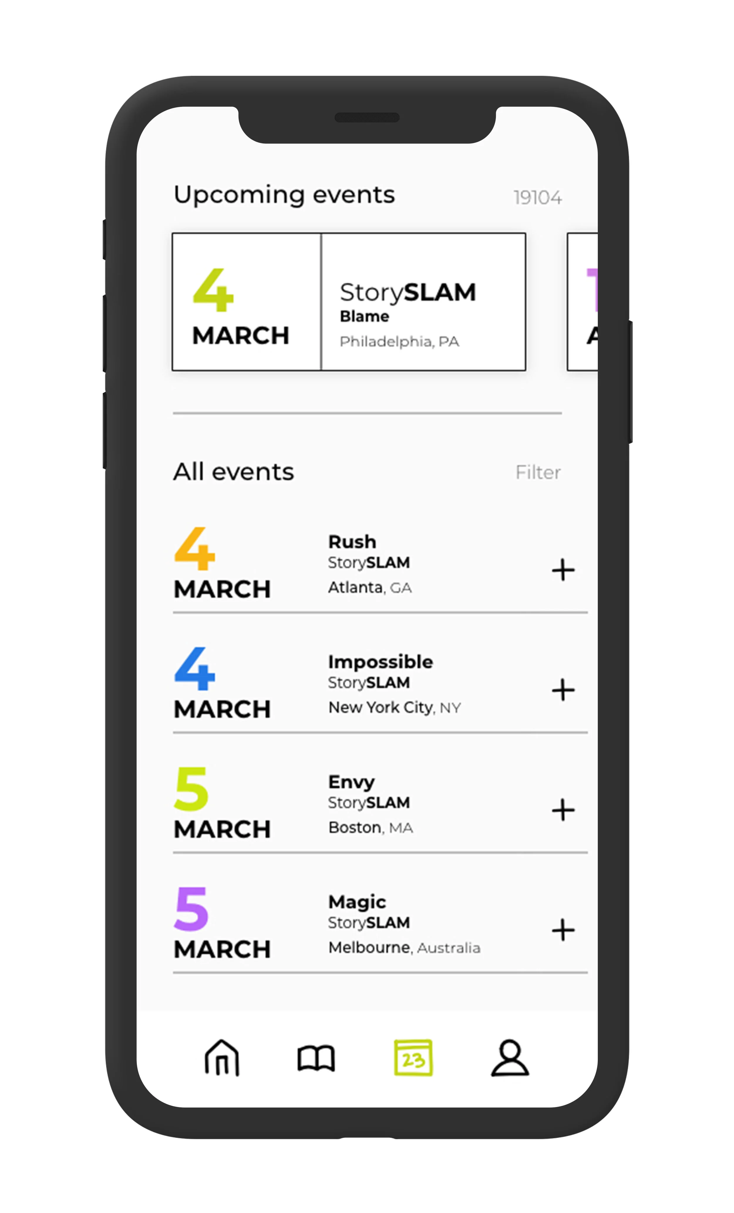
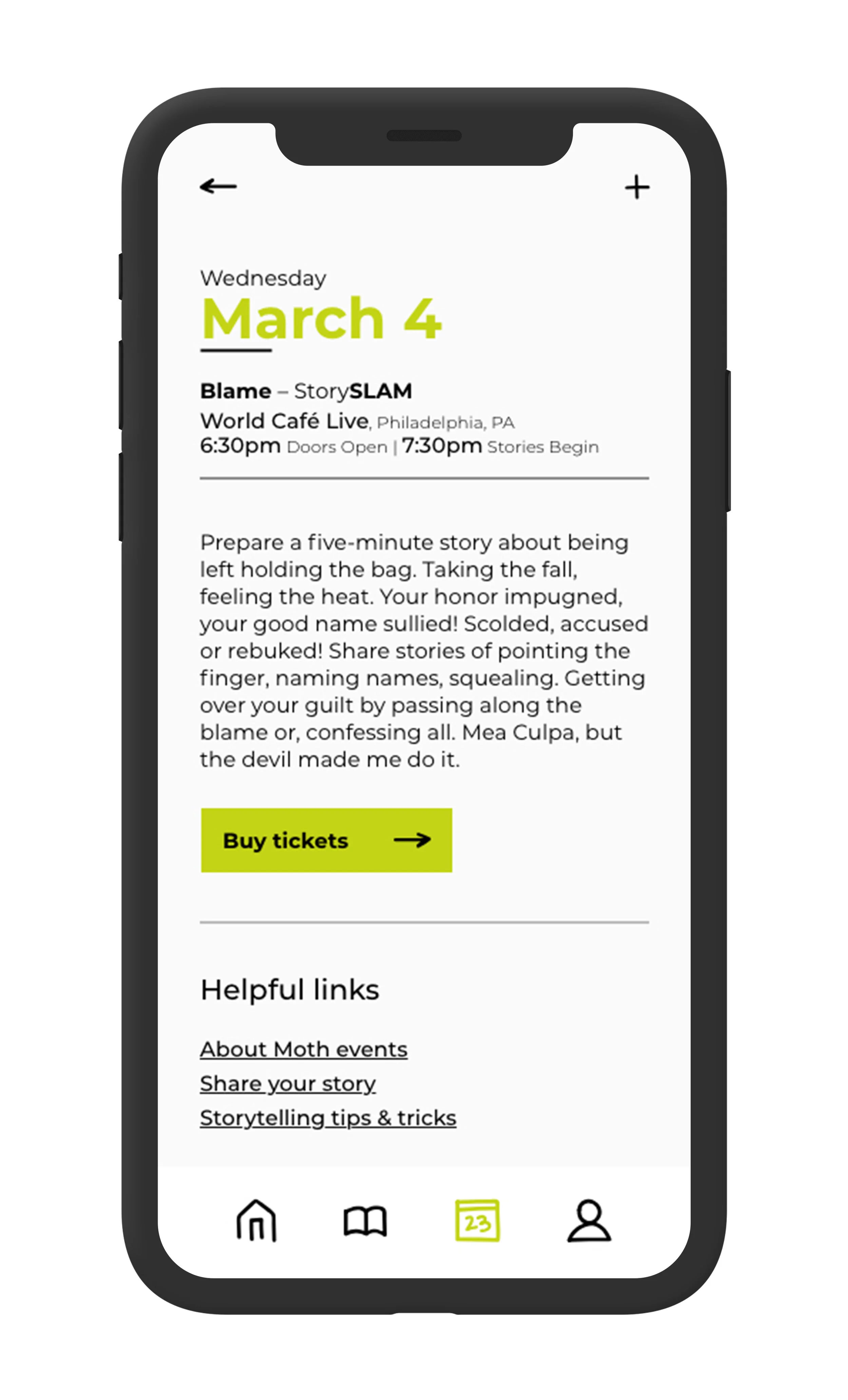
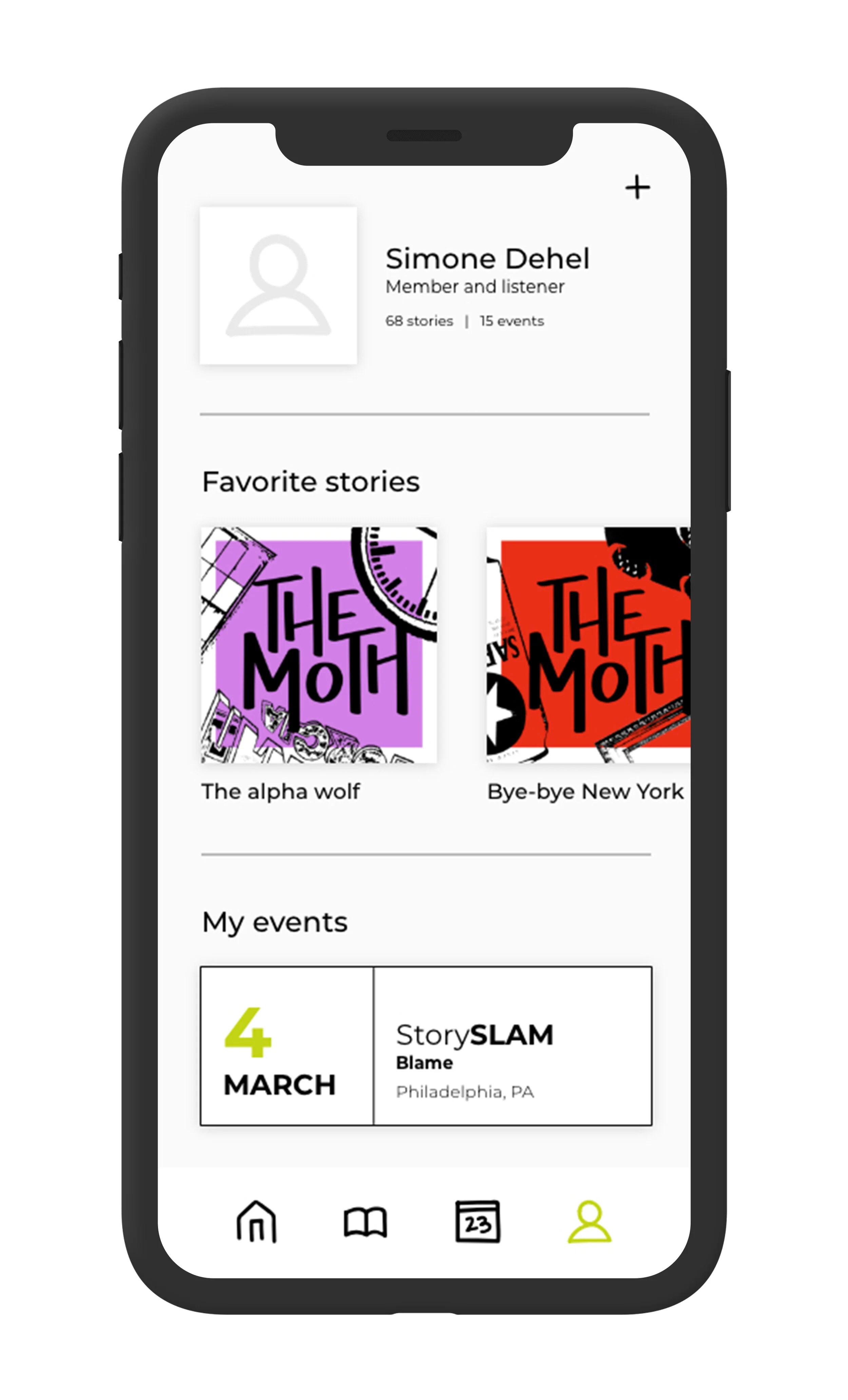
A major goal for this redesign was to create a more cohesive digital experience for dedicated Moth supporters. Unlike The Moth’s preexisting website, this mobile app not only focuses on The Moth’s stories and live events but also drives people to become active listeners and members.
User flow
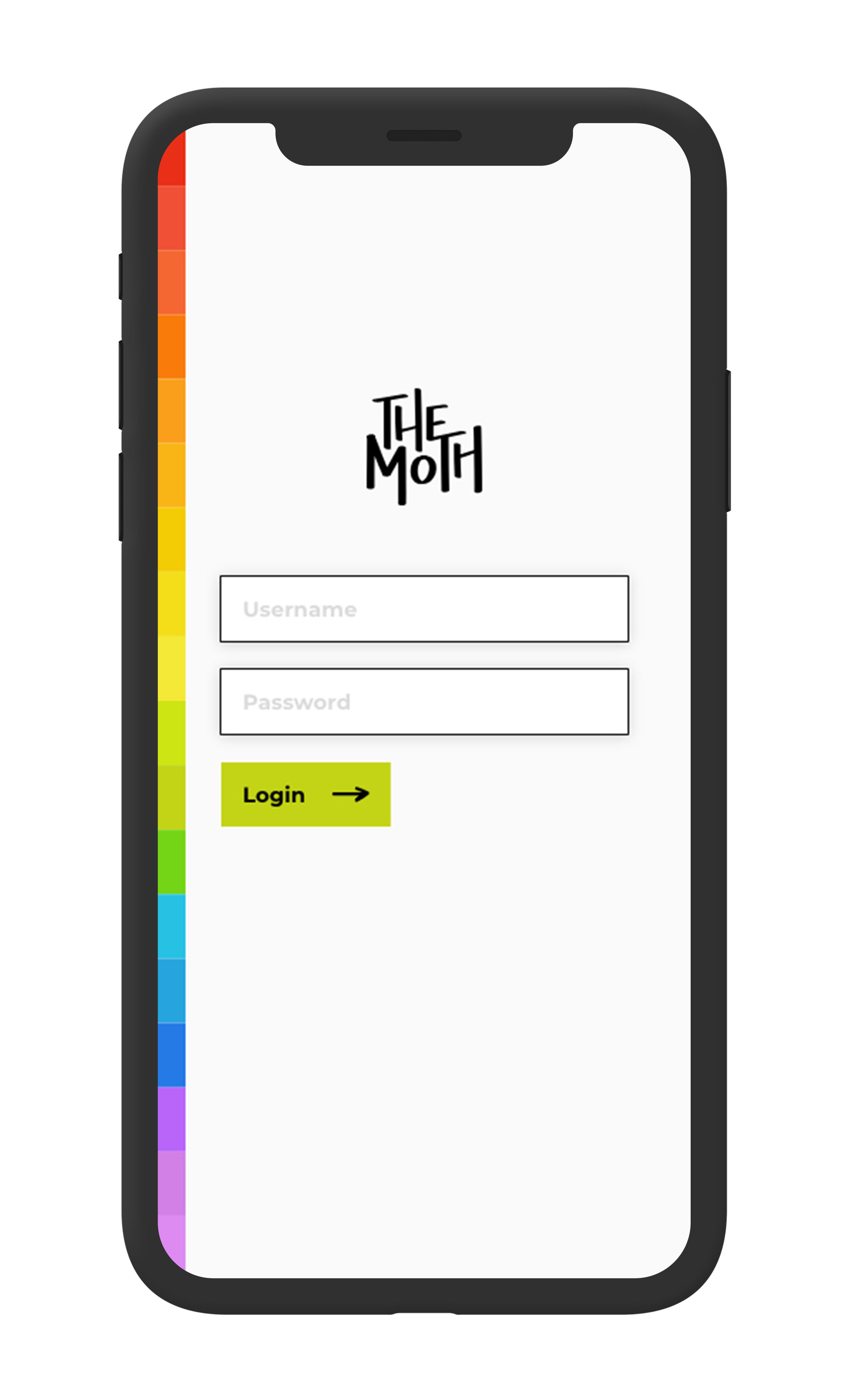
Wireframes
Like the framework, the wireframes highlight the stories and live events.
App elements
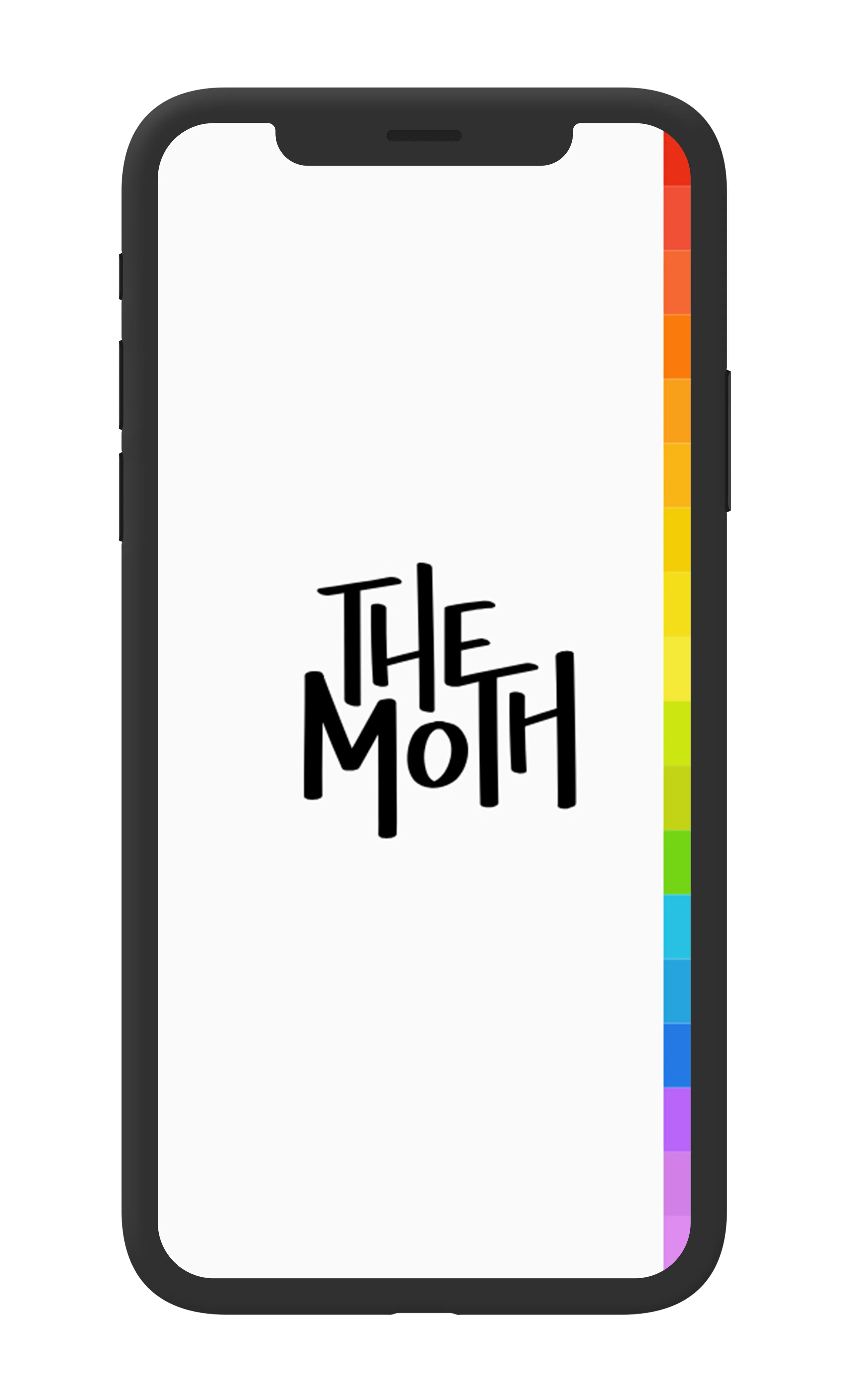
The app’s logo, typography, and icons borrow trends from The Moth’s core brand elements. However, the color palette remains minimal to help highlight the story covers throughout the app.
